Theory "Scrum Charts"
As you have probably already noticed, we have reached the end of a Sprint with the Sprint Retrospective. However, there are two more chapters ahead of you: Scrum Charts and Release Planning.
In this chapter you will learn more about Scrum Charts.
Charts for the Sprint
To visualise where the Developers currently are in the Sprint, there are two different charts that can be used. The most commonly used chart is the Sprint burn-down chart. The Sprint burn-up chart is an alternative to the Sprint burn-down chart. Another chart - which, however, does not represent the current progress of the Sprint - is the Velocity chart.
Sprint burn-down chart
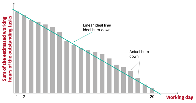
Every day, the working hours of the tasks which are still unfinished in the current Sprint, are estimated and then added to the Sprint burn-down chart. The result is the image of a staircase leading downwards. In order to be able to estimate the working hours of the tasks that are still undone, the Sprint Backlog is used. This shows you directly which user stories are already "done" and which tasks are still outstanding. The tasks that are in "To Do" and "WiP" are still open and must be estimated. As soon as the open tasks have been estimated and included in the Sprint burn-down chart, they are compared with a linear ideal line with an equal decrease in unfinished tasks.
What is a linear ideal line?
A linear ideal line is a line that runs linearly from day 1 to day 21 (for a four-week Sprint). It starts at day 1 and intersects the ordinate where the estimated working time of all tasks is. It descends linearly until it intersects the abscissa on the day after the last Sprint-day (day 21). Ideally, the tasks should be completed in such a way that there are no more open tasks at the end of the Sprint. The linear ideal line serves as a comparison between the 'burn-down on paper' and the actual burn-down.
If it turns out that the team was not able to complete the planned workload by the end of the Sprint, it will be reduced in the next Sprint or increased in the opposite case.

Sprint burn-up chart
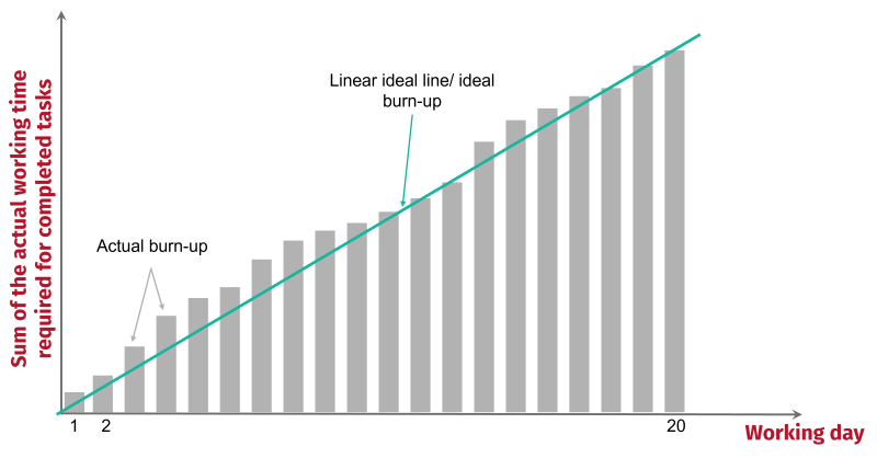
An alternative to the Sprint burn-down chart is the Sprint burn-up chart, in which the working hours of the completed tasks are plotted, thus creating an upward chart. In this case, it is not the estimated working hours that are plotted, but the working hours that were actually needed to complete a task. The diagram starts at zero and ends on day 20 (for a four-week sprint). Again, a linear ideal line can be drawn: Starting at the origin (day 0 / working hours 0) and it ends at day 20 at the level of the estimated working hours. If the estimated working hours differ from the actual working hours, the workload should be reduced or increased in the next Sprint, as described above - or the estimation skills should be improved.

Why is the Sprint burn-down chart more popular?
Since the Sprint burn-down chart starts with the total of all working hours and the remaining working hours become less and less during the Sprint, this can have a motivational effect on the Developers. They can see day by day what they have already achieved and that the tasks are getting fewer and fewer.
Velocity chart
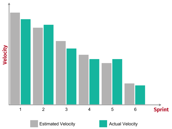
In contrast to the two charts above, the Velocity chart does not show the tasks that have already been completed or are still to be completed, but it is a visual representation of the speed of development. The Story Points play a central role here.
Do you still remember what Story Points are?
The perceived workload and value of a user story. Story Points can be influenced, for example, by uncertainties, by the amount and complexity of the work. They are neither monetary nor time-based, but are themselves the unit of measurement for estimating the Product Backlog Items.
The Story Points are important to determine the Velocity, because the Velocity is calculated by dividing the sum of the Story Points by the number of Sprints to date. To create a Velocity chart, you need two key figures: the estimated Velocity per Sprint and the realised Velocity per Sprint.
Now you can enter two columns in a chart for each Sprint: the estimated Velocity and the realised Velocity. With the help of the Velocity chart, you can better estimate the Velocity for future Sprints.

Deviations from prediction to reality
If the predicted Velocity and the actual Velocity differ, then this information can be taken into account in future Sprint planning. But just because, for example, in the first Sprints the estimated Velocity deviated greatly from the actual Velocity does not mean that this will always be the case. The insights of the Velocity chart are not set in stone. Moreover, these findings should never be used to compare different teams of Developers.
Release burn-down chart
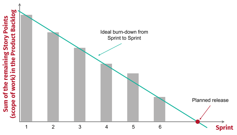
A chart at the level of the overall project is the release burn-down chart. This describes the current project progress or the remaining scope of work compared to the linear ideal line.
With the release burn-down chart, the time of a release can be determined as soon as
-
the Velocity of the Developers is known or can be well estimated and
-
the total number of entries in the Product Backlog required for the release is stable.
Using an ideal line, an intersection between the ideal line and the x-axis can be found, taking into account the total number of Story Points to be processed for the selected release and the Velocity.
This makes it possible to estimate after which Sprint a release is possible. If it turns out that the time cannot be kept due to too many entries in the Product Backlog (or due to lower than planned Velocity), the scope of the entries in the Product Backlog must be shortened in order to be able to stick to the time.
Note the following when creating the release burn-down chart:
- The working basis is the expenditure estimated at the beginning of the project for the implementation of the entries in the Product Backlog.
- Y-axis: Sum of the efforts in Story Points
- Estimated and summed point value of all entries in the Product Backlog that are relevant for the release.
- X-axis: Number of Sprints
- Based on the Velocity of the Developers

Ideal line and trend line
In addition to the linear ideal line, you can also insert a trend line in the release burn-down chart. In contrast to the ideal line, the trend line does not show the ideal course, but the estimated course, based on past Sprints. This means that if Velocity was slower than estimated and fewer Story Points were realised in each Sprint than expected, the trend line will intersect the x-axis further back than the ideal line. In this case, more Sprints than planned are likely to be needed before releasing. However, this line should also be handled with caution: it only reflects the current trend - but if the Developers have a different Velocity in the subsequent Sprints than during the first Sprints, then the release date can shift again. Therefore, the trend line should be checked after each Sprint and adjusted if necessary.